Impact
Redesigning the navigation resulted in scores 2x usability benchmark scores than before. Additionally, it increased vertical time spent and click through ratings
Introduction
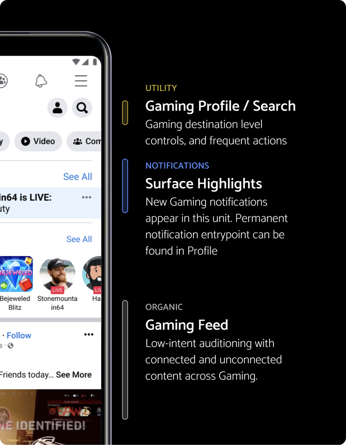
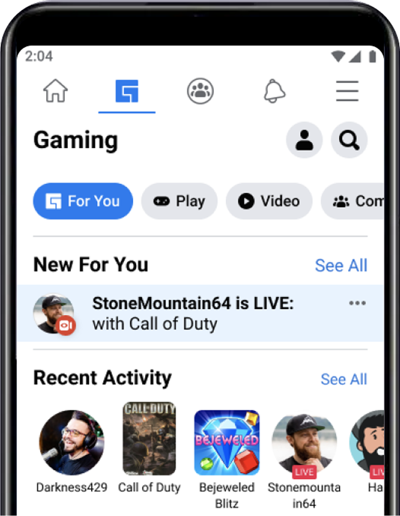
Gaming tab lives within the Facebook app. Within the tab itself are a number of content areas which users can explore. Our problem starts with the data point that our users are not utilizing the navigation.
Problem
Our problem starts with the data point that our users are not utilizing the navigation. Click through rating was low on pill navigation Low percentage of users scrolling through the pills to see additional content UX Research reported that users did not feel like gaming content was “for them” despite being the target audience
Goal
To develop a navigation in which users can answer: “what can I do here?” and “what is this space for?”
Purpose of Navigation
Navigation and discovery: Allow users to navigate to different content areas Help users to understand what other content is available
My role
- Led design effort: explorations on design, content strategy, and research needs
- Project management: developed project expectations and timeline
- Cross collaboration: led leadership alignment and outward communication to other teams
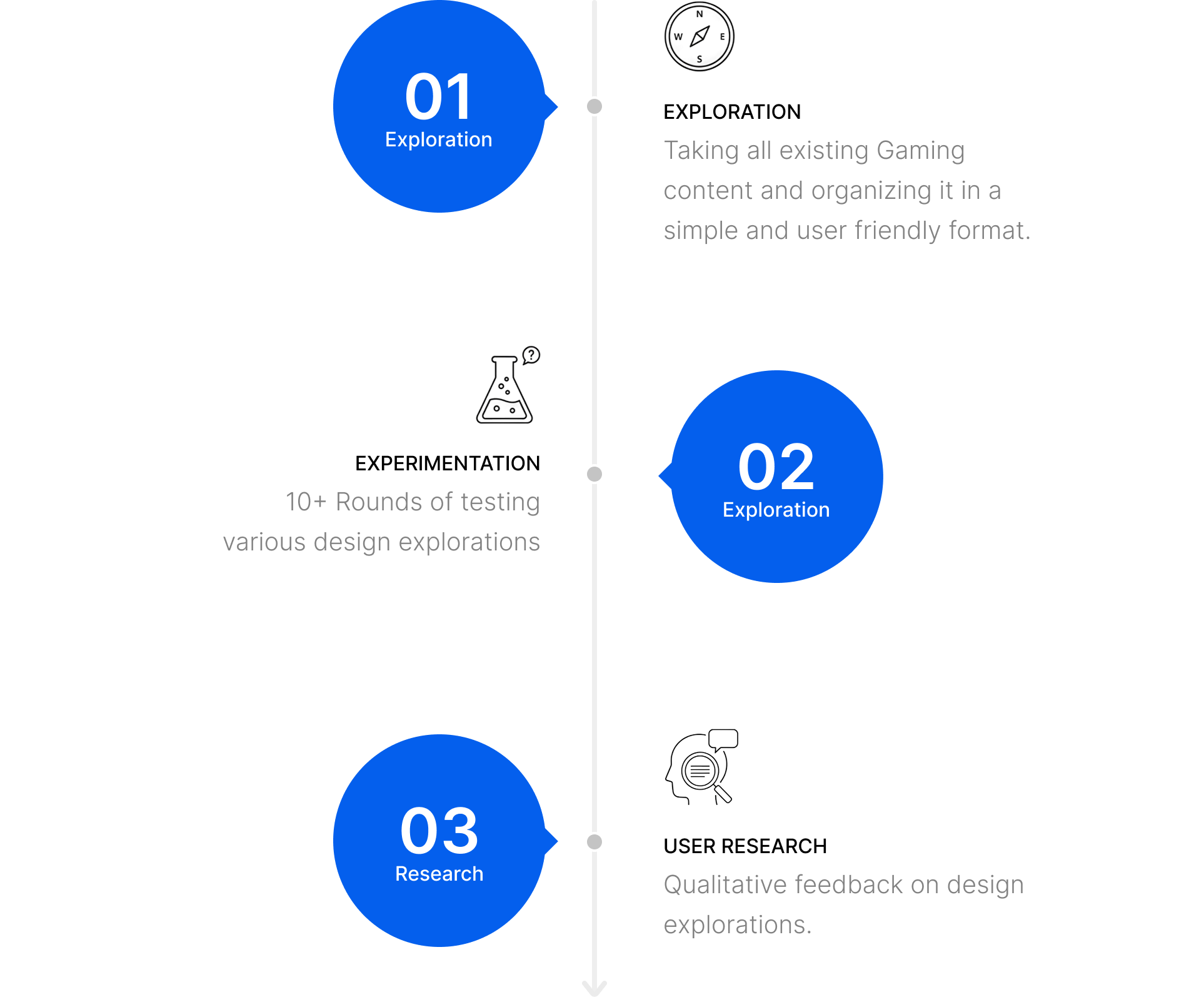
Process
The navigation redesign took 3 phases of development: design exploration, engineering experimentation, and user research
Shipped Impact
Navigation and IA resulted in higher click-through-rating, and increased traffic to subsurfaces
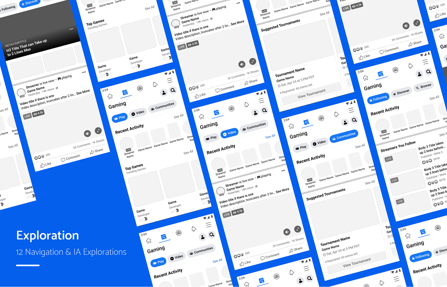
IA Approaches
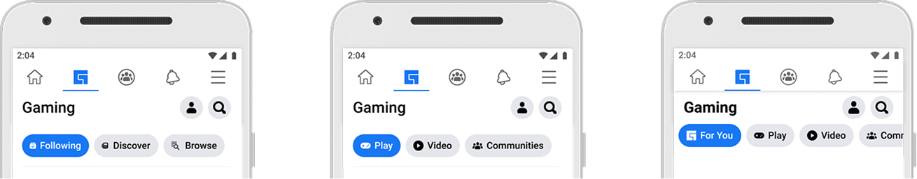
Personal
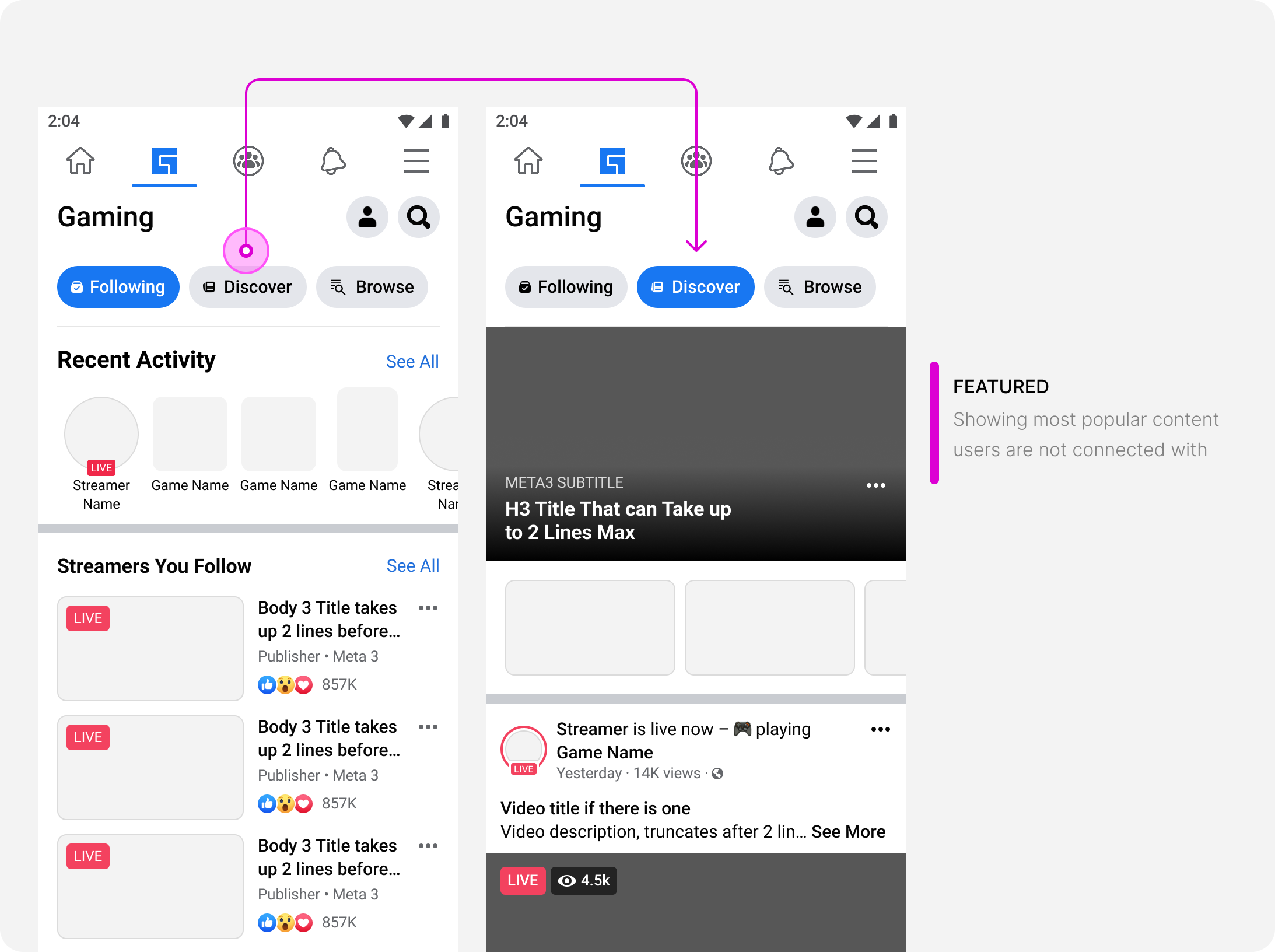
Following / Discover / Browse
- As a user, I want to navigate through content based on it’s relationship to me
Action
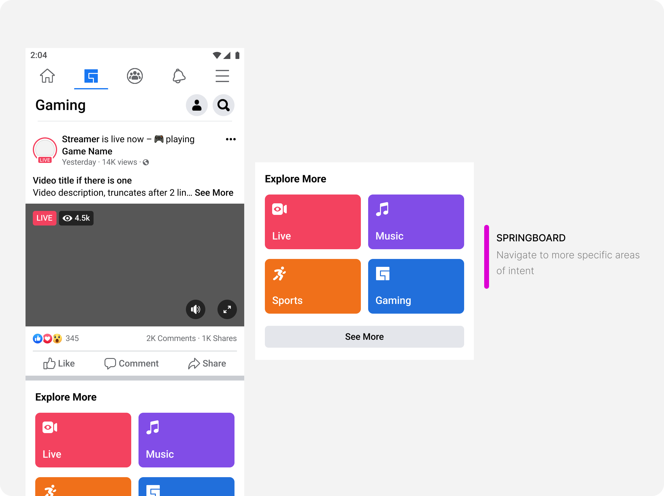
Play / Video / Communities
- As a user, I want to navigate through content based on the action I can take
Hybrid
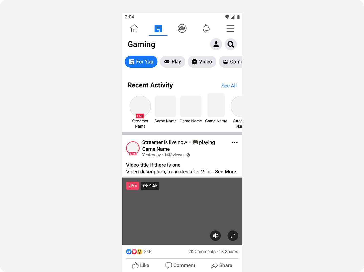
For you / Play / Video / Communities
- As a user, I want to navigate through content both through their relationship to me and the actions I can take
Navigation types
There are 4 types of navigational components within the Facebook Design system. We started here to determine if these could fit our needs:
- Subsurface: navigates to a brand new page/surface
- Filter: takes content which is already loaded and filters down to only show selected content
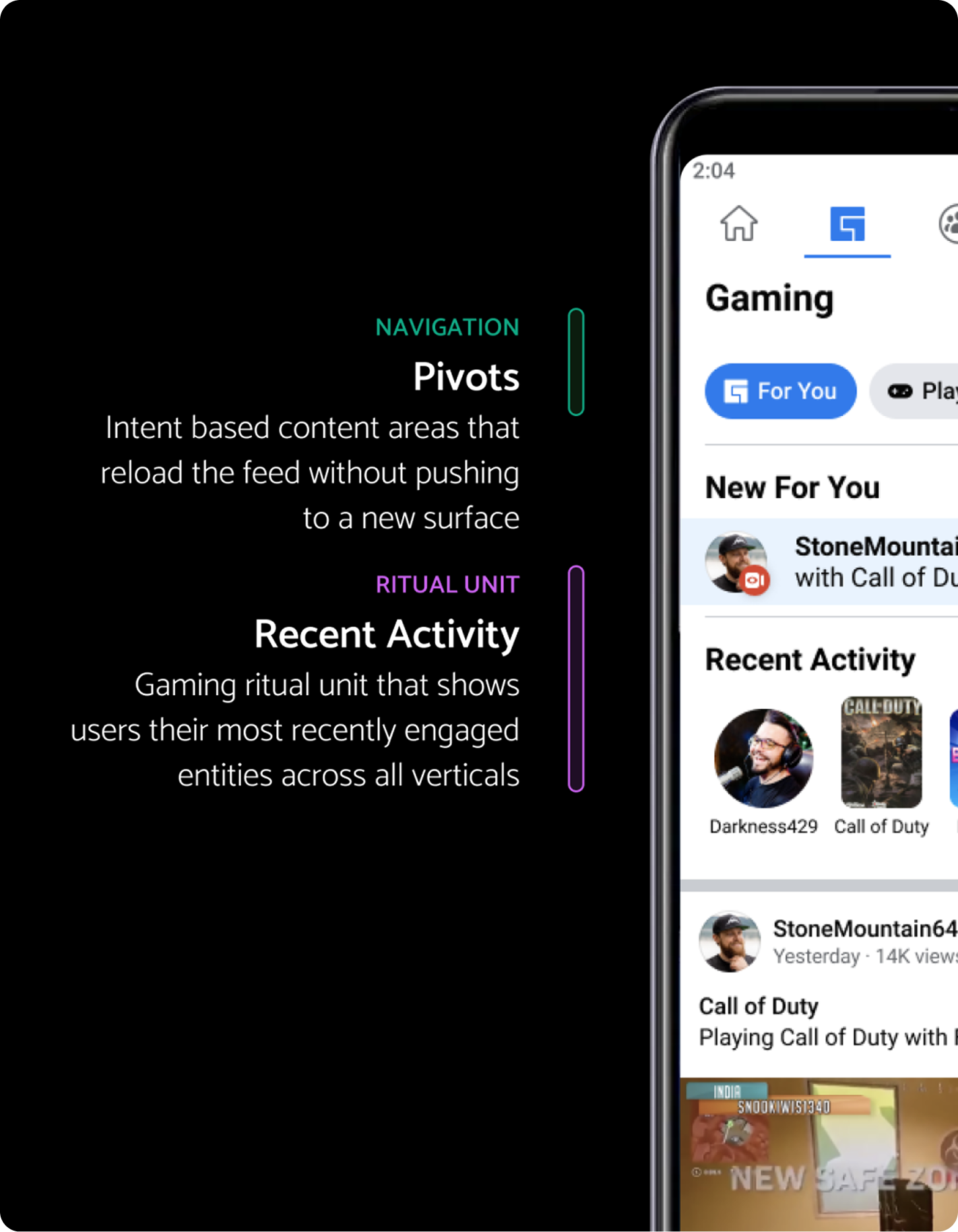
- Pivot/lens: reloads the feed to show selected content
- Flat feed: navigation is done more passively through the feed
Navigates to new page or surface.

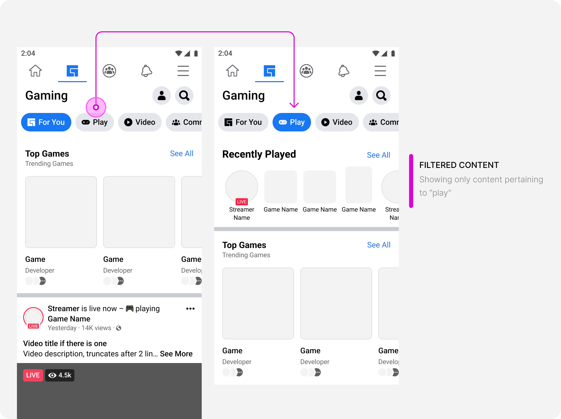
Takes current content and filters down to selected content
Reloads the content below the navigation to show selected content.
Content is primarily passive scrolling and more heavily reliant on machine learning for targeting and springboards. The flat feed does not consider users who do not want to passively scroll, but come to gaming with an intent. This type of navigation is not a consistent experience.
Principles
Grounding decisions on principles
- Predictable: I know where to find what I want
- Scalable: Content will scale with new architecture
- Approachable: Easy to understand
- Personalized: Caters to my needs
Solutions
In addition to these, we iterated more within these areas to fine tune our results. We measured success based on:
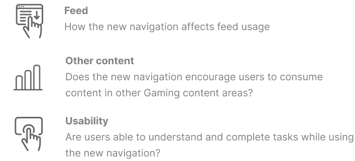
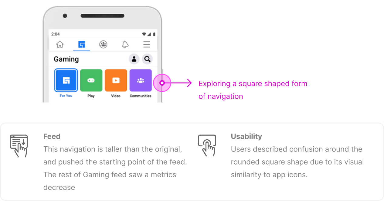
One hypothesis for poor navigation CTR was that it was too hidden. The goal for these explorations was to explore ways to visually emphasize the navigation.
Overall, this style of navigation showed decline in metrics for feed and usability.
Overall, this style of navigation was visually effective in emphasizing the navigation without taking away from the rest of the Gaming content
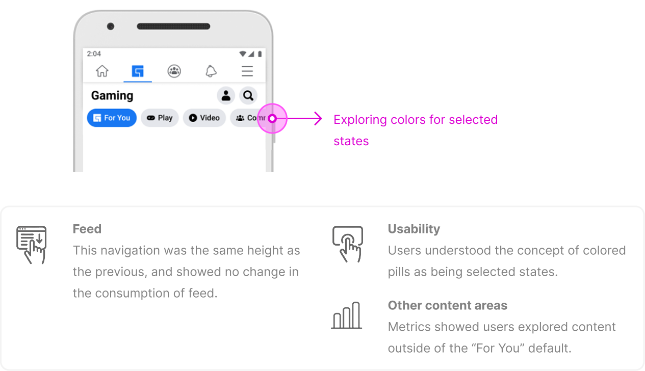
We moved forward with the navigation with colored selected states:
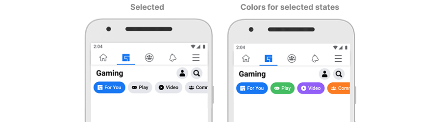
The success criteria for colors are more subjective and based around user feedback (usability)
In choosing colors for the selected states, we started with the color palette approved by Facebook Design Systems. And then created a list of considerations.
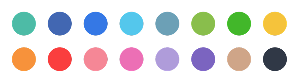
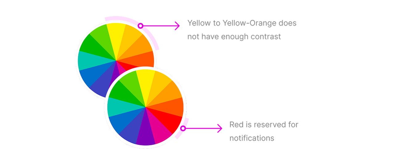
- Visually, the color must have enough contrast against white text (which means no yellows)
- Red is reserved for notifications
- The default pill must be blue (Facebook Design pattern)
- Colors need to be easily differentiated from one another
Here we explored a few color sets for the navigation (showing all buttons in selected state).
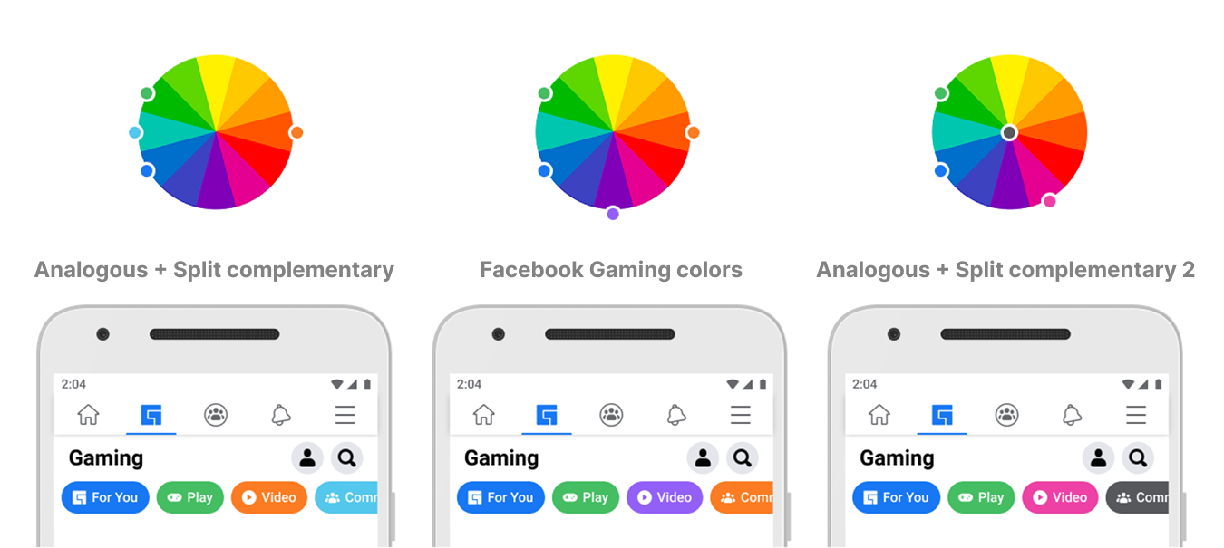
Our final iteration of colors was able to take in all the considerations as well as the additional feedback:
- Visually, the color must have enough contrast against white text (which means no yellows)
- Red is reserved for notifications
- The default pill must be blue (Facebook Design pattern)
- The colors must not be associated with competing brands
- The colors must not look disabled
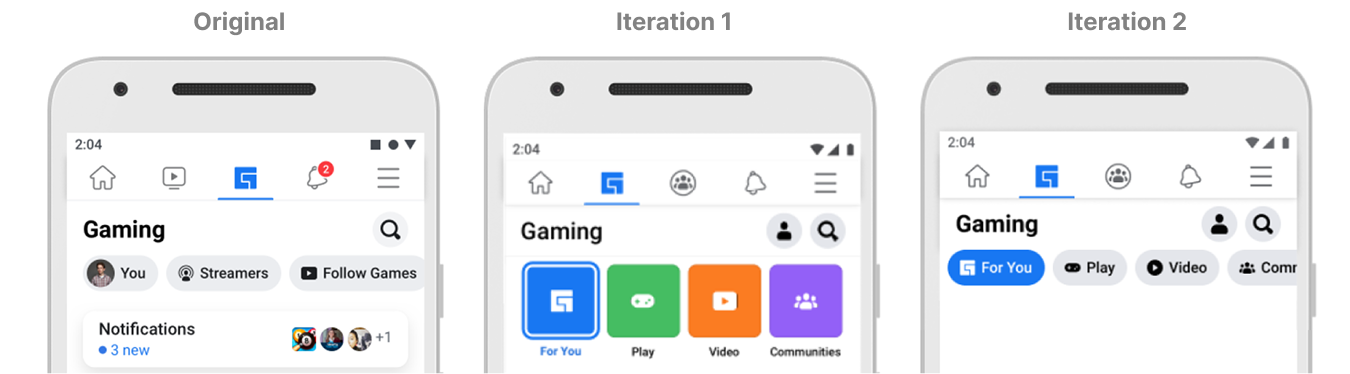
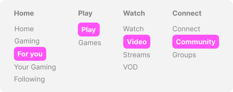
The intent for the new navigation was to focus on a navigation that was both personal and actionable.
- Home: Default landing experience - this should be a more personalized
- Play: Content users can play (games hosted on Facebook).
- Watch: Content users can watch (Live videos, videos on demand)
- Connect: Content users can connect around
In collaboration with content strategy and user research, we determined the best solutions for each content space.
Outcome
Hybrid & pivots was the only solution that respected the principles and goals set for navigation
Summary
Based on these behaviors, the project successfully allowed users to answer: What can I do here and what is this space for?
- Increased click through rating: navigation usage increased significantly
- Time spent: Users were found to spend more time within each of the content areas
- Usability: Users research showed our usability benchmark increased by 2x with these changes